Designer Takashi Sato's Comment
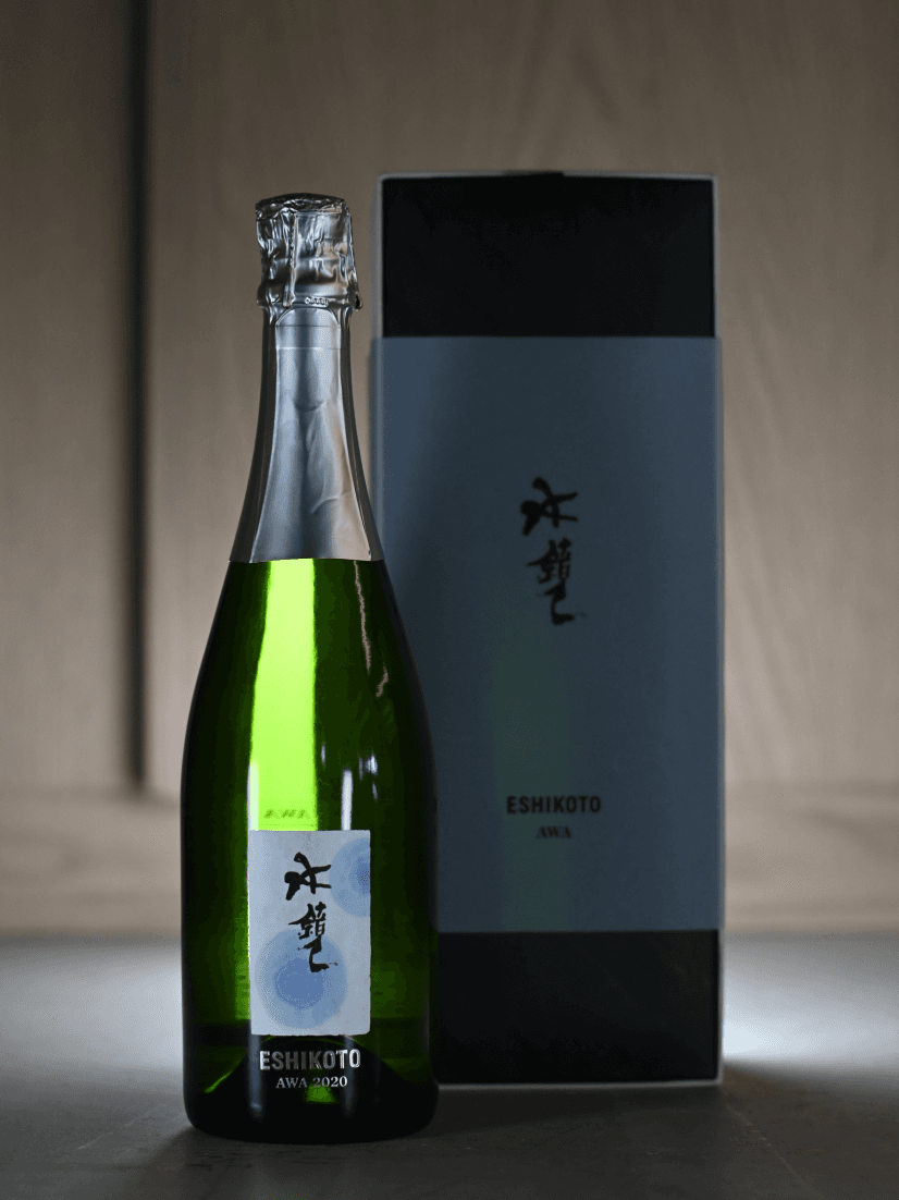
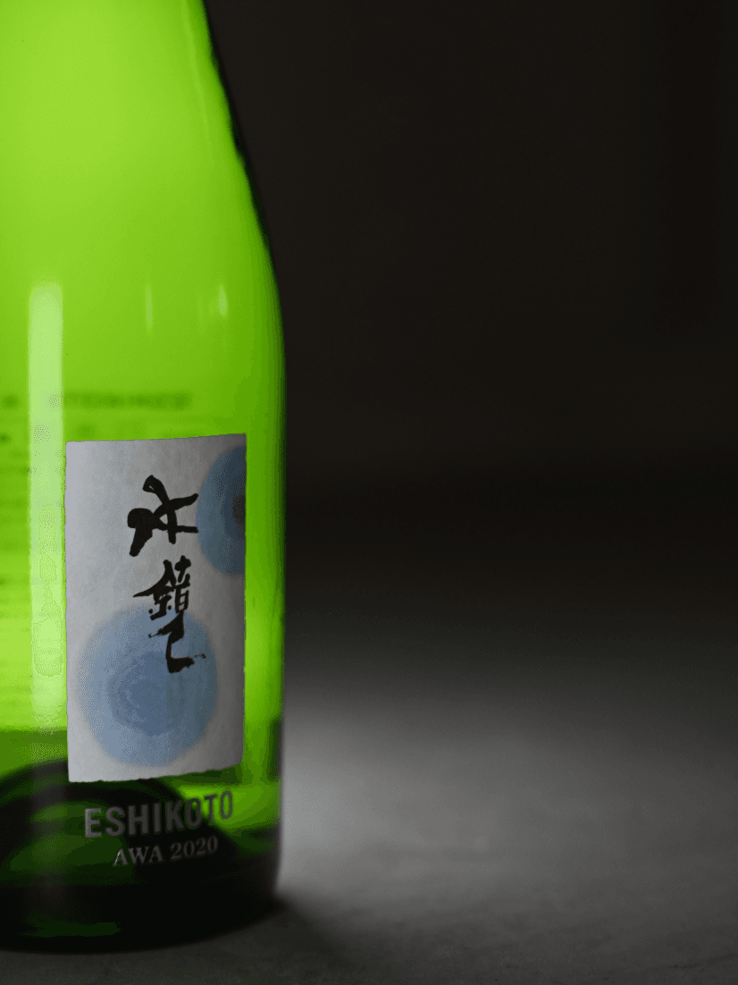
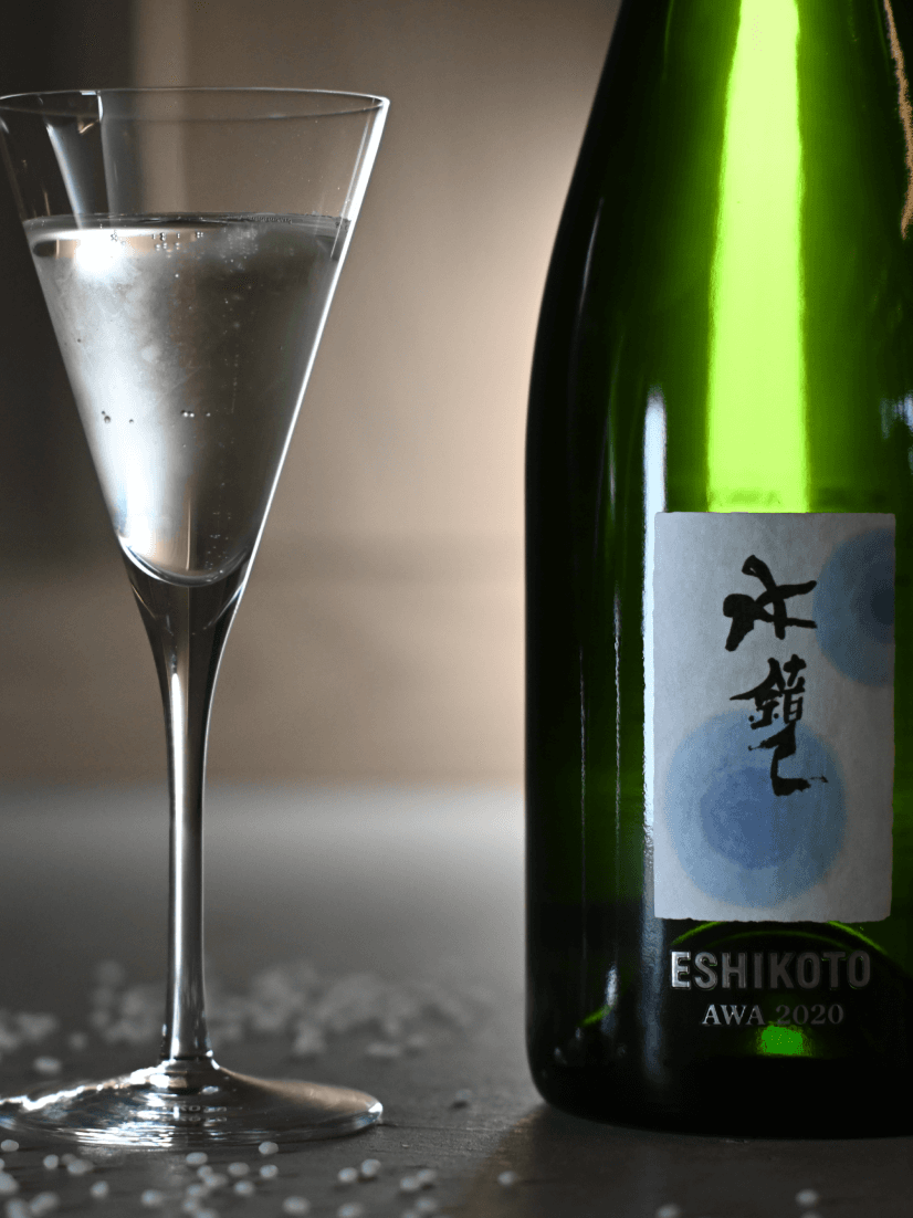
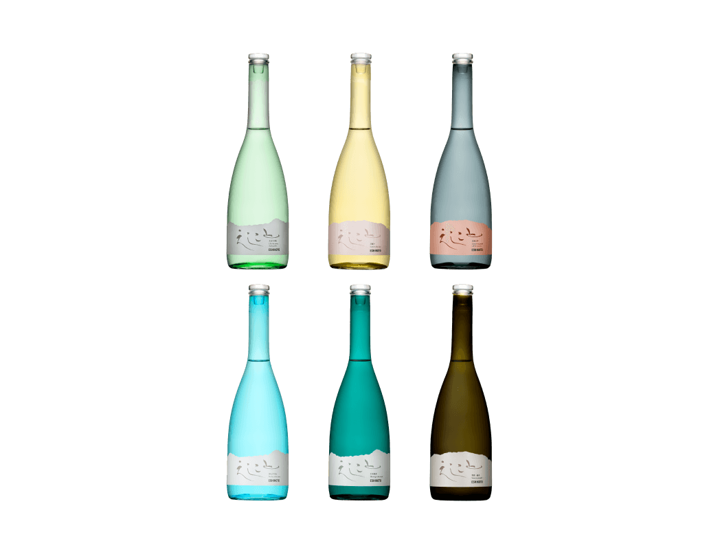
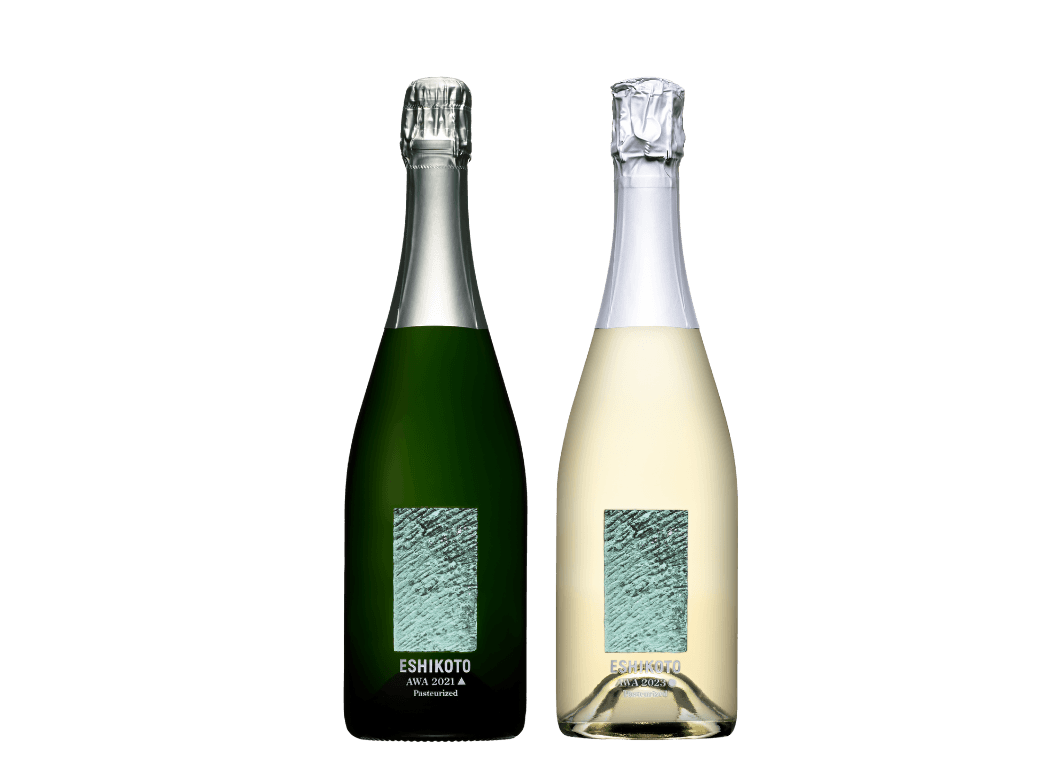
ESHIKOTO is a name that reads "eternity" (永) backward. The character "永" has an ancient meaning of "good things" hidden within it. It has always been there quietly, unnoticed by anyone. Rather than creating a name, I found something that already existed and named it, embodying a unique idea of discovery by turning the existing upside down.
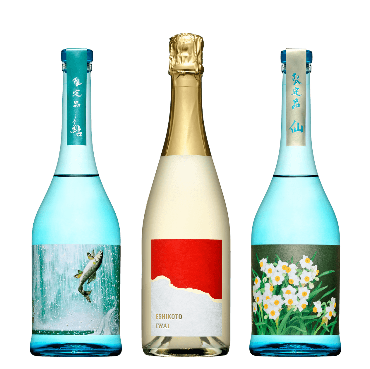
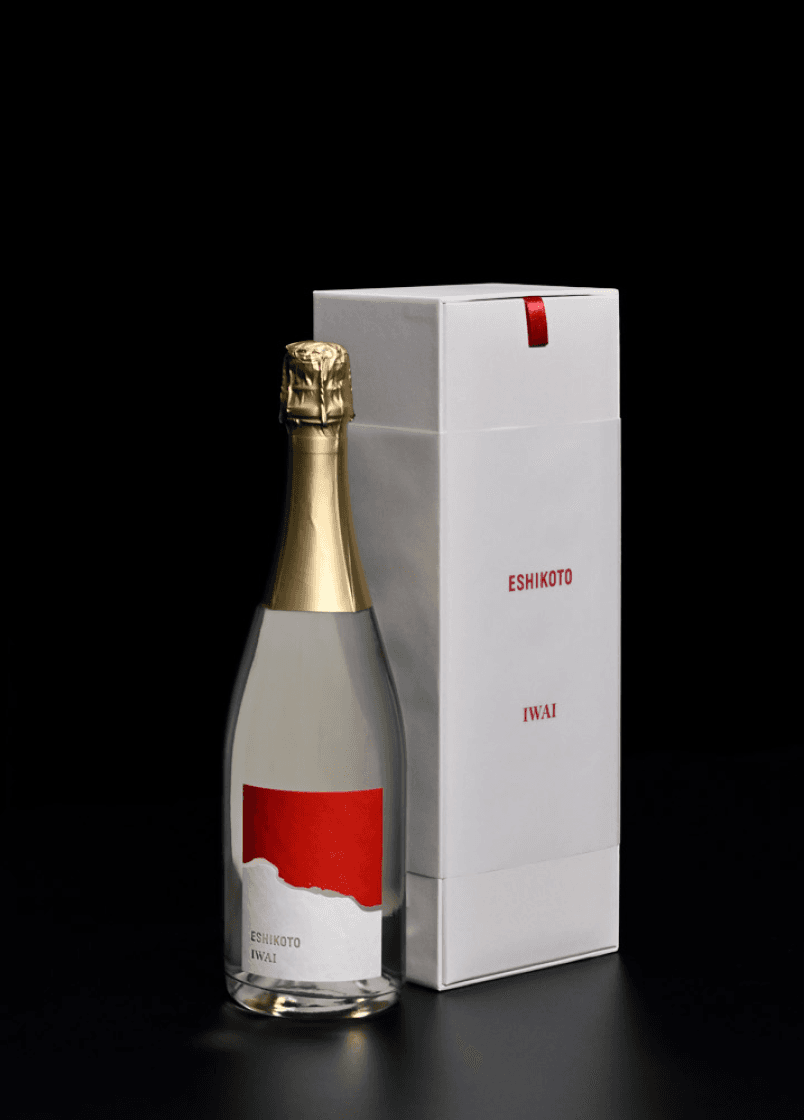
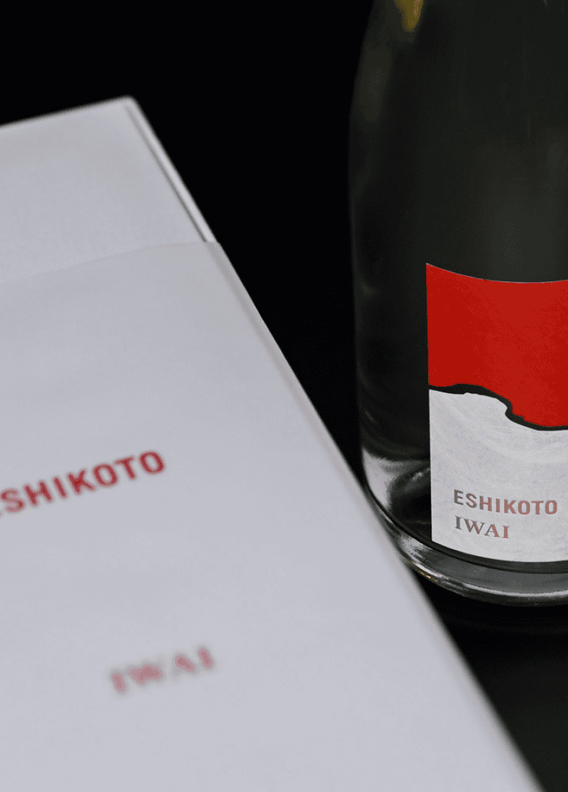
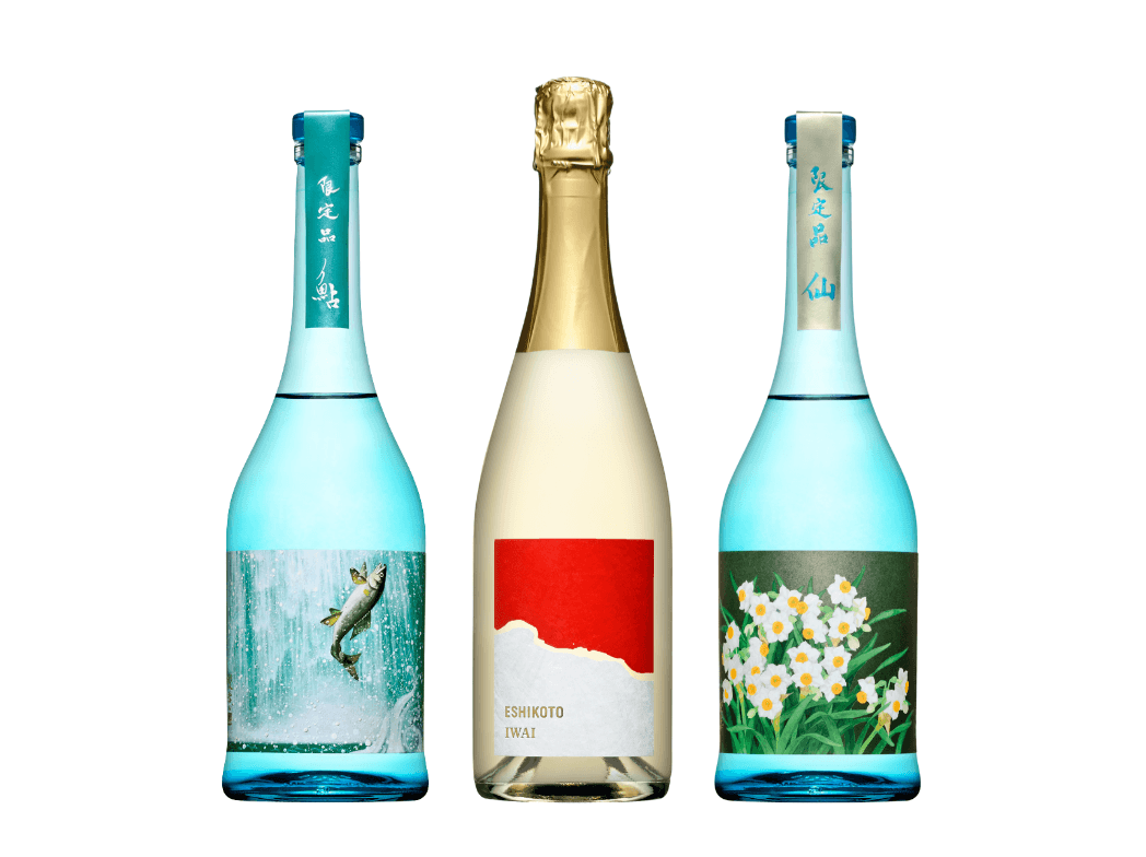
The special sparkling sake sold from the Christmas season to the New Year should have a design that anyone can recognize as "auspicious." Speaking of auspiciousness, red and white come to mind.
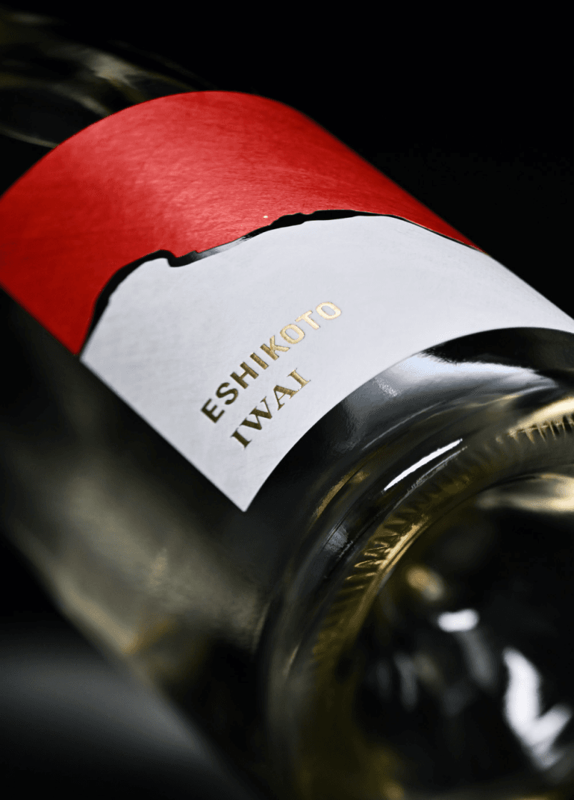
This label expresses that directly, but the boundary between the red and white is not a straight line. Upon closer inspection, there’s a small white dot just above the mysterious flowing line in the center.
Now, what could this be? The design of this label, along with the origin of the name ESHIKOTO, can be said to emerge from an adult's playful spirit.
Design Supervision by Takashi Sato
Graduated from the Department of Design at Tokyo University of the Arts in 1979, completed the graduate program in 1981. He has worked on packaging designs for "Lotte Xylitol Gum" and "Meiji Delicious Milk," as well as graphics for posters, branding for products and facilities, and corporate CI. He serves as the general advisor for NHK E-Tele's "Design Ah" and "Design Ah Neo," and is the director and chief curator of 21_21 DESIGN SIGHT, where he has planned and held numerous exhibitions. His publications include "Shaping Thoughts" (Shinchosha), "The Book of Marks" (Kinokuniya), and "Just Enough Design" (Chronicle Books), among others. He has received numerous awards, including the Daily Design Award, the Minister of Education, Culture, Sports, Science and Technology’s Art Encouragement Prize, and the Purple Ribbon Medal.